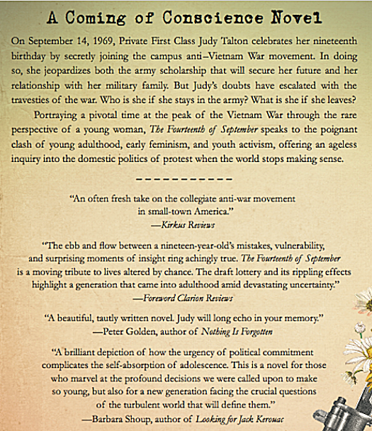
Cover Reveal: First Peek at the Final Book, Counting Down to September 18 Pub Date
/
I’m quite excited to introduce the cover design for The Fourteenth of September, the novel I’ve worked on for so many years. I have to admit, it’s pretty thrilling to see it come to life, and I AM palpitating more than a bit…
I must say, the journey to this final cover has been a surprisingly challenging process. I probably should have known this, coming out of over 25 years in marketing. Looking back, when the cover is done it seems so obvious, like the title. However, after years of wrestling this complex story into a narrative, and naming it (thank you, Gary Wilson), and now again having to digest it all into a single image with the power to instantly engage the reader who would most love, enjoy, and relate to it? Well, that clearly required a specific eye and expertise far different from anything I’d done before.
I knew the cover design would belong in the bailiwick of the publisher. And yet, I kept trying to envision it. I pestered early readers and designer friends about what they thought. I was both excited and full of trepidation as I handed over this book, my baby, with a leap of faith that the publisher would find the perfect image. I soon found myself, irony of ironies after all those agency years, as …the CLIENT… of those who knew far more than I about the type and images that are most alluring, that will still pop in thumbprint size in Amazon. In short, who knew way more than I could imagine. I was happy to defer. My publisher, She Writes Press, began work in November.
BACKGROUND ONLY. THEN: AUTHOR, GET OUT OF THE WAY
Fortunately, rather than have to figure it out myself, I was asked only to share my thoughts and any preliminary ideas I may have had. Fun as this was, it also underlined how formidable the task. I soon realized that, just like with the manuscript, it would be so easy to tip the balance and make this look like fan fiction for a Peter Fonda movie or, worse, a full-out Full Metal Jacket/Apocalypse Now story of men at war in-country, instead of a woman’s story, on campus. The cover needed the gravitas and familiarity of recognizable Vietnam imagery, but not the male combat or psychedelic ’60s assumption.
I was worried about the crowded field of iconography: helicopters, soldiers in a jungle with rifles. All very masculine and, to tell the truth, overdone. I struggled to make a list of what to eliminate for consideration: imagery that was hackneyed (a peace sign? please), just as I wrestled in the manuscript with dialogue for my characters. I couldn’t have everyone say “Hey, man,” even though in real life they actually did. And not everyone could have a musical name, like my protagonist, “Judy Blue Eyes,” but some could. Above all, we had to steer clear of the ’60s flower-power, fat Peter Max lettering. The war was not a “happening.” Balance was key, or there was danger the cover could send a completely wrong message about the actual subject of the book.
An Idea in Vogue
In December, based upon the roughest hint of a thought from me about flowers in a National Guard gun, the crack design team at She Writes Press was inspired by, of all things, a 1945 issue of Vogue magazine that ran on V-E Day with a beautiful, impressionistic illustration of pastel flowers seeming to grow out of the bayonet of a rifle. I was immediately taken by the surprisingly feminine image of war and felt it perfectly depicted the woman's point-of-view message of my story.
They added the period-specific typography used on a draft card circa the 1969 timing of the novel, and creatively stacked the words “September,” “Fourteenth,” and “Dragonette,” all with virtually the same number of letters, as if I’d chosen them intentionally for that purpose. There was some concern that the “feel” was too ’40s, and we experimented through January and early February with more era-specific images, but the impressionistic illustration won out. Women have always been a vital part of any war. This cover would work. The design was approved and final art was underway. I had a terrific story idea to pitch to Vogue lined up, merchandising ideas identified, and, significantly, we had time to spare in the publishing cycle.
Love and Ruin

GREG samata, eighth-grade boyfriend
I was totally in love with my cover. But then, to show that the road to great ideas is rocky, indeed, though the image was on a site offering it as available for licensing, it required an unanticipated “extra” layer of approval from the estate of the original artist. Though that illustration had been commissioned originally by a newsstand magazine, the estate felt that its use on the cover of a book for sale, was too “commercial.” (I can't even show it here). At the eleventh hour, permission was denied and we were back to square one, but worse…by now it was March, and we were facing an immediate deadline to get advanced review copies published in time to ensure critical reviews and long-lead publicity.
A collaboration began where both She Writes and I scrambled to tap our resources. Though my luck was running badly, my life remained charmed in at least one key area. My eighth-grade boyfriend (true story), Greg Samata, is a world-class graphic designer. When I went to him for advice, over tomato soup at Beatrix, he vaporized my stress and told me (as he did with my website) that he would handle it, not to worry. The publisher agreed.

PAUL sahre, illustrator
Greg called his friend, renowned illustrator Paul Sahre, to render the original idea into a ’60s-specific depiction and add his genius. The She Writes design team then took over to incorporate it beautifully into their original, elegant design and add mysterious but wonderful finishing touches to ensure optimum reproduction in any medium, as well as made room to include a wonderful blurb from best-selling author Jacquelyn Mitchard. Finally, She Writes held the presses, and we were able to include quotes from late-breaking Kirkus and Foreword Clarion reviews, along with additional blurbs from authors Peter Golden and Barbara Shoup, to polish off the back cover. Within two weeks we were back in business and on deadline, if under the wire. My great thanks to the entire expanded team. My nerves have yet to completely settle, but I’m in love again.
Better Than Vogue
Despite my affection for the original illustration, I must say the final cover is better. It’s a beautiful and provocative image of the feminine flowers of peace growing out of the hard metal of war, the conflict of Judy’s coming-of-conscience decision that will define her for the rest of her life. I’ll be curious to hear what you think.
Available Now for Pre-Order

The novel is now available for pre-order on Amazon, Barnes & Noble, IndieBound, and Apple iBooks for delivery on the publication date of September 18.

To celebrate the launch of the book, there will be a series of events in Chicago and New York. If you’re in either of these cities, save-the-date invitations are forthcoming, and I hope you’ll join me in person and get the book at one of the parties so I can sign it for you. Or, pre-order and bring it with you. I’d love to celebrate with you live.
If you’re elsewhere, I’d encourage you to order as early as possible. All pre-orders will be recorded on the drop date of September 18, and the more I have, the higher my “best of" numbers will be on the various sites—and the greater will be the interest in publishing my next book (yes, there is one, more on that later.) This way you’ll all be both enjoying the book (fingers crossed) and supporting my new writing career.
Thanks for being with me on this journey. I can’t tell you how much I appreciate it.
Lovely, Rita*
*Even better than Judy Blue Eyes